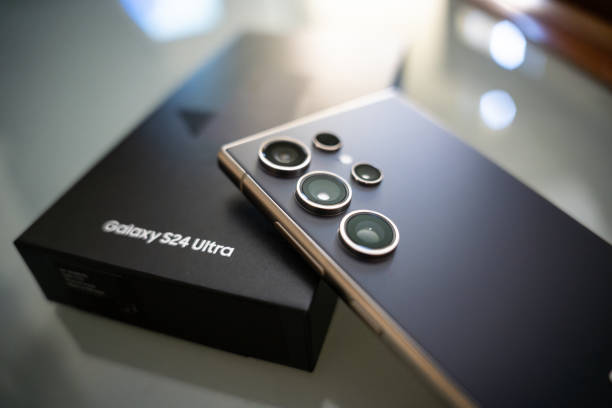
Imagine this: You’re holding your increasingly larger smartphone screen in one hand, trying to reply to an important message, but your thumb can’t quite reach the “Send” button at the top of the screen. This kind of everyday, small frustration is at the heart of what drove Samsung to launch One UI.
1. Design philosophy: everything revolves around the thumb rule
One UI was born from a simple yet fundamental observation: as phone screens continue to expand, traditional UI design has become outdated, placing users at the edge of the action. One UI’s design philosophy can be summarized in two core concepts: one-handed operation first and immersive experience.
1. Ultimate one-handed operation: separation of viewing area and interaction area
This is the most iconic design innovation of One UI, also known as “one-handed operation first”.
The interactive area is moved down: Samsung has pushed all major interactive elements—such as the huge title at the top of the list, navigation buttons, and all the actions that require clicking—to the lower half of the screen.
Optimized thumb reach: This design allows users to easily tap the required options with just one thumb when using large-screen phones, without having to stretch or use both hands.
“Information View” and “Operation Panel”: The top of the screen becomes an area responsible only for displaying content (view area), while the bottom is dedicated to performing tasks (interaction area). This is a clear functional division, reducing accidental touches and improving efficiency.
2. Focus and Comfort: The Victory of Flat and Dark Mode
Modern life is full of digital distractions, and One UI is committed to reducing these visual noises to enhance user immersion and eye comfort.
Visual “breathing space”: The interface adopts a simple and flat design language, removing unnecessary lines and decorations, providing more white space and “breathing space” for information.
Optimized Night Mode: Unlike a simple color inversion, One UI’s Dark Mode is deeply optimized system-wide. It leverages the unique characteristics of AMOLED screens to achieve significant power savings by disabling pure black pixels. This is not only for aesthetics, but also for eye health at night or in low-light environments.
3. Ecosystem consistency: seamless cross-device experience
Consistency and fluidity are the third pillar of One UI. Whether you’re using a Galaxy phone, tablet, or watch, you’ll experience a consistent interface, icons, and interaction logic. This system-wide consistency creates a more reliable and easier-to-learn digital ecosystem for users.
2. Core Arsenal: Functional Analysis to Improve Productivity
If the design philosophy is the skeleton of One UI, then the rich and powerful feature set is its flesh and blood. Samsung is not satisfied with simple aesthetics, it has invested heavily in productivity, customization, and security.
1. DeX mode: Turn your phone into a desktop computer
DeX mode (Desktop eXperience) is the ultimate embodiment of One UI’s productivity ambitions. When your phone or tablet is connected to a monitor, it instantly switches to a full-featured desktop environment similar to Windows or macOS. This transforms your mobile device into more than just an information consumption tool, transforming it into a fully functional mobile workstation. For digital nomads who need lightweight remote work, DeX is a game-changer.
2. Good Lock: Endless customization possibilities
For those who enjoy deep customization, the Good Lock module is a cheat code for One UI. It is an official collection of apps that allow users to modify and optimize almost all system elements, including:
Lock screen layout
Notification panel style
Task switcher animation
Volume control panel color
If other UIs only provide a limited “theme store”, then Good Lock provides you with a system-wide source code-level customization toolkit.
3. Privacy and Security: The Ironclad Fortress of the Knox Platform
As personal data becomes increasingly important, security is essential.
Secure Folder: This is One UI’s killer feature, built on the Samsung Knox security platform. It creates a hardware-isolated, encrypted space within the device for storing private photos, sensitive apps, or work files. It’s completely isolated from the device’s main operating system, providing a private “digital safe.”
Permission transparency: One UI adds real-time indicators for microphone and camera usage, letting you know at any time whether an app is “eavesdropping” or “peeking” in the background, greatly enhancing users’ sense of control over privacy.
Conclusion: This is not just beautification, but the evolution of interaction
The success of One UI lies not in whether it looks better than stock Android, but in whether it is better to use. It finds a rare balance between comprehensive features and user-friendliness.
As we’ve seen in our review, One UI is a well-thought-out system. Its “one-handed operation first” approach addresses the everyday pain points of using a large phone, while features like DeX and Good Lock cater to everyone from casual users to deep customization enthusiasts.
Of course, no operating system is perfect. One UI has been criticized for its somewhat lengthy animations or its overabundance of features, resulting in a learning curve for new users. However, each iteration proves Samsung’s willingness to listen to community feedback and continuously refine the user experience.
What are your thoughts? With smartphones becoming increasingly bulky, do you prioritize a minimalist operating system over a feature-rich and highly customizable experience like One UI? Share your thoughts in the comments below!